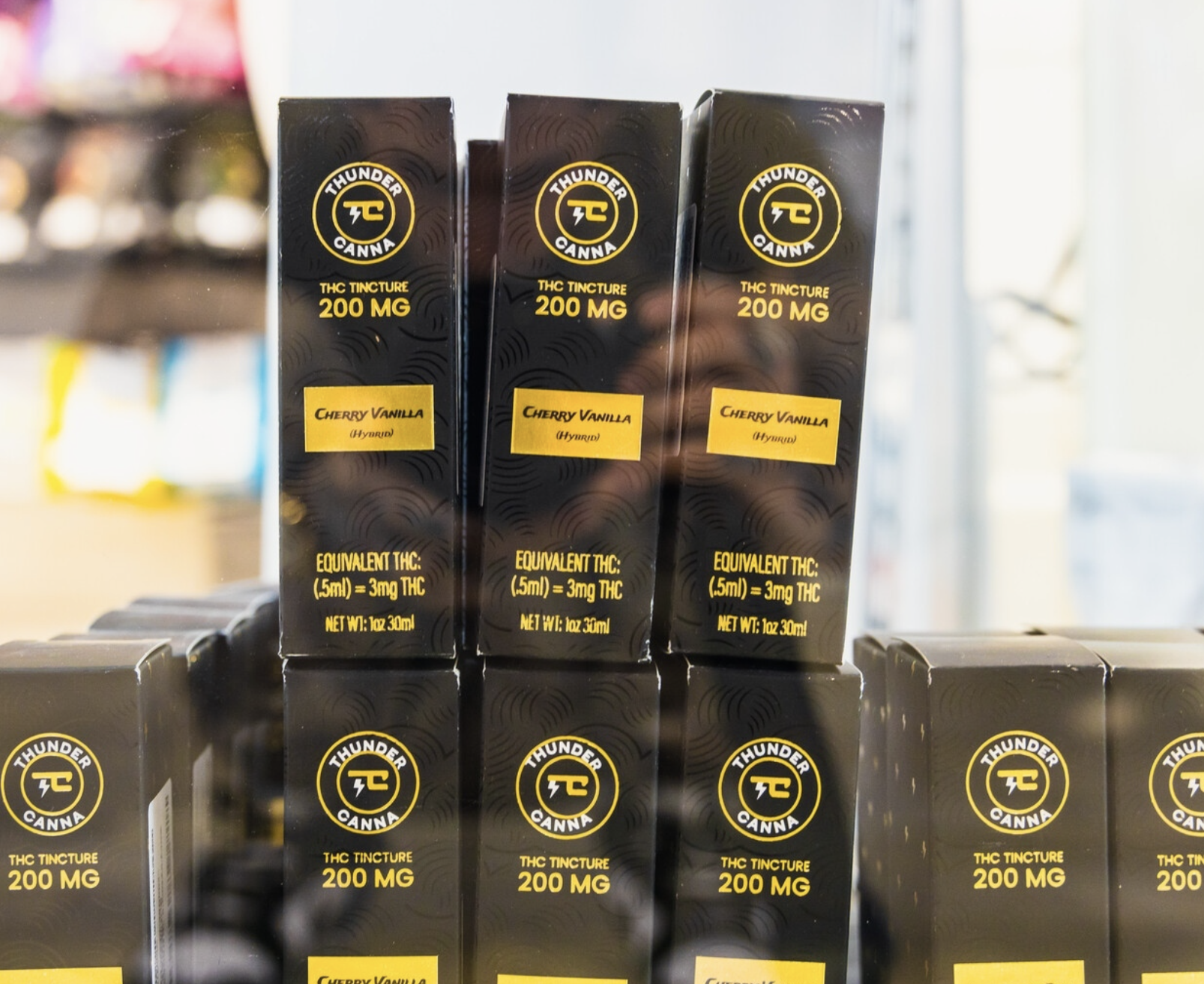
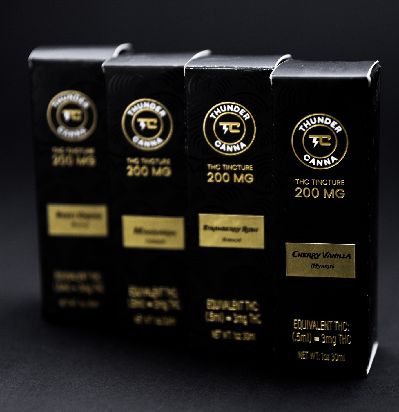
Thunder Canna Branding
The client wanted the logo to be very simple but have a unique touch that made it distinctive. I wanted the focus to be the thunder bolt which later would be the foiled in gold and all over their branding as their logo icon. What started off as a simple logo would because a beautiful package design.


